A trend line showing your “average day” is a popular metric for gaining insight into your blood glucose over time.
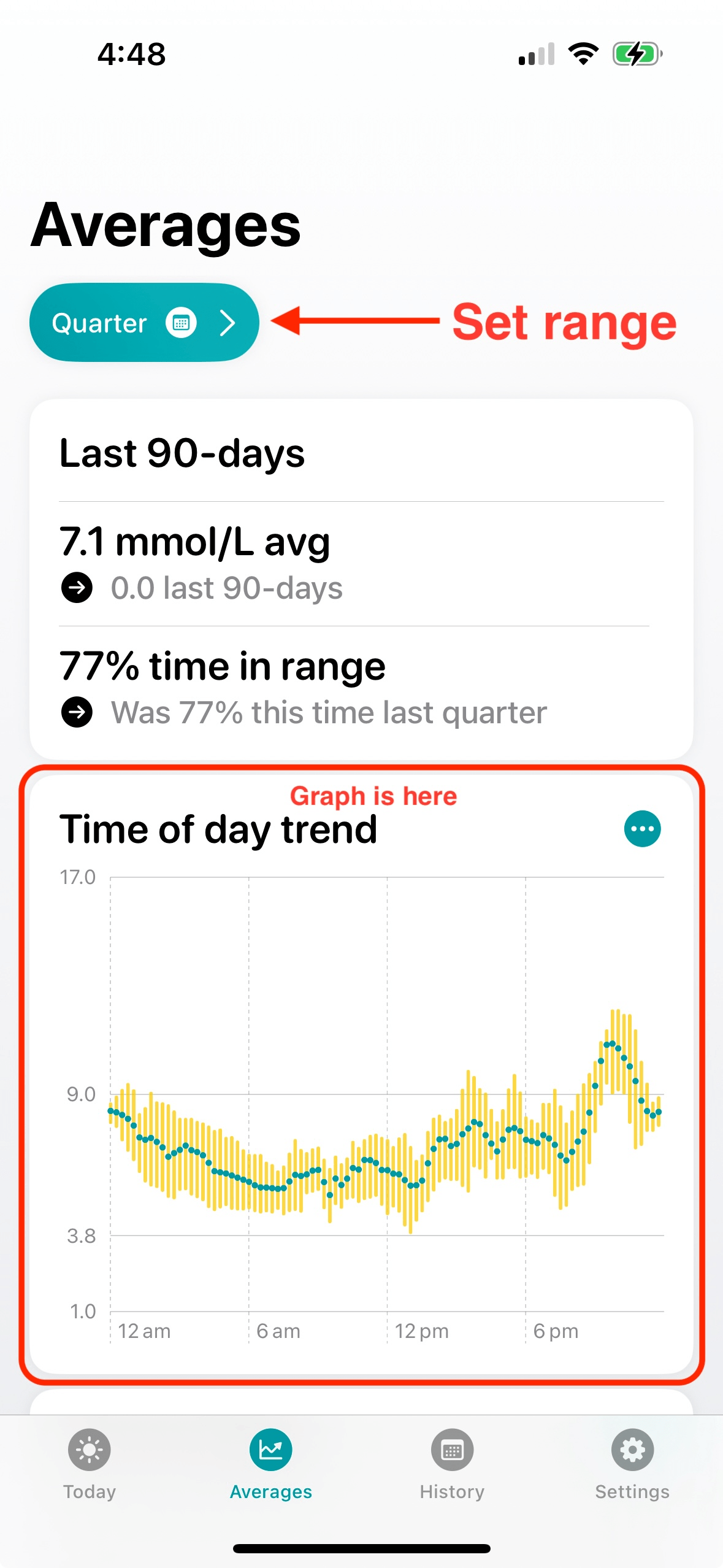
In Glucomate, the time of day trend graph shows your average reading for each period of the day over the selected timeframe. It splits the day into 15-minute intervals, and for each interval the graph highlights your average reading, and shades readings from the 25th to 75th percentile. This can be configured to show the complete range if you like, but this is often less useful as it has a larger variance. Glucomate can calculate and display this average day line over a period of your choosing - either 7, 14, 30, or 90 days.
To view this on your iPhone or iPad in Glucomate, open the app and navigate to the Averages tab. Make sure your desired range is set, and scroll down until you see the “Time of day trend” card. Simples!
Glucomate reads data that’s already stored in HealthKit on your phone, and uses it to generate insightful charts like this one.
Sound interesting? You can download Glucomate for iPhone and iPad on the App Store.